After 3 years of art school and 2 years working at a boutique graphic design studio, there is one rule that emerges: a rule so highly regarded in the industry that ignoring it would be like asking Thomas Keller to pair his fine steak with Two Buck Chuck. That rule is:
OBEY THE WHITE SPACE.
Any accomplished designer will tell you that the white space on a page is as important—sometimes even more so—than the text or graphical elements. It lets the eye rest, or gives it direction. It can create balance between the other elements on the page. In the best designs, it can create meaning.
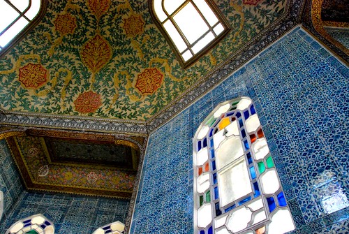
Istanbul laughs in the face of white space. It thumbs its nose at white space. Indeed, Istanbul ran that white space right outta town.
The results are insanely beautiful.
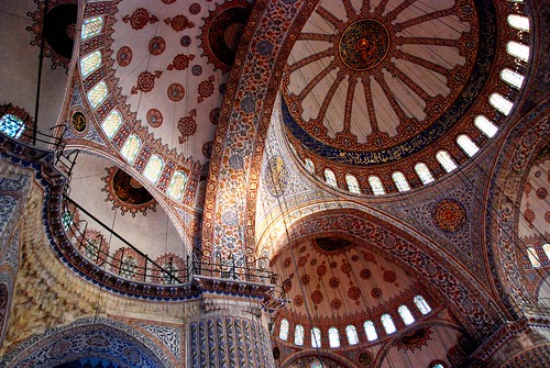
The ceiling of Sultanahmet (The Blue Mosque).
We spent most of our days with our necks craned up and our jaws open in awe. When I was in Oaxaca a few years ago, I was obsessed with all the beautiful patterned tiles. But THIS…this takes it to another level entirely.
Every surface that can be covered with a pattern, is.
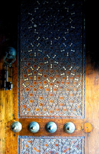
Mother-of-pearl inlaid door at the Blue Mosque.
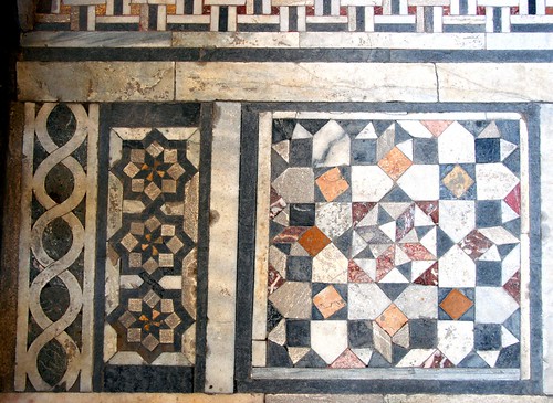
Stone floors at Topkapi Palace.
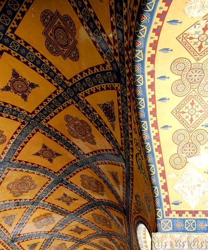
Painted ceiling in the upper gallery, Haghia Sophia (Aya Sofya).
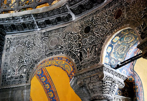
Byzantine arches and pillars at the Haghia Sophia (Aya Sofya).
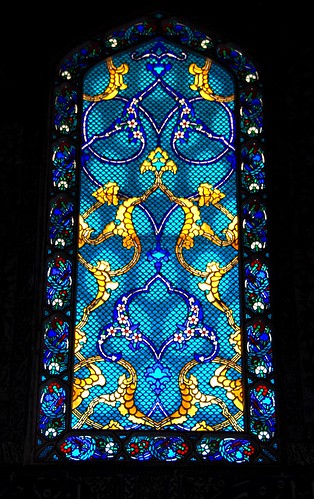
Stained-glass window, Topkapi Palace.
And what is in between those patterns layered on patterns? Is it enough to execute patterns in stone, tile, glass, wood, and paint? Of course not! Let’s throw some mosaics in there while we’re at it.
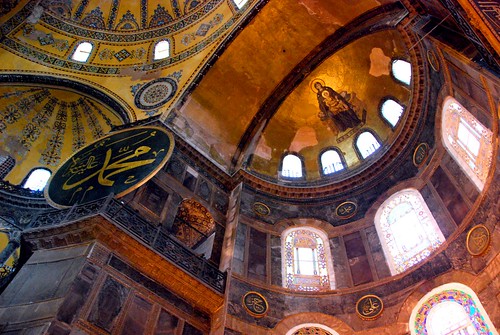
Virgin mother and child mosaic in the half-dome, Haghia Sophia (Aya Sofya).
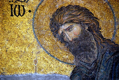
The Deësis mosaic in the Haghia Sophia (Aya Sofya).
Screw white space.
I see you left a comment on my blog about my discovering yours…don’t know how I linked to you but enjoying your adventures
I love Turkey too
Have visited twice and your pix make me want to plan another trip
wintkat
Oh, Hope and Jeremy….these are gorgeous…..thank you for sharing in photos and in words….xoxo
AWESOME!…………..
Respect white space. Screw white space.
Reminds me of the Taj Mahal. All that amazing Persian/Muslim/Moorish architecture. Hopefully we’ll get to Turkey one day!